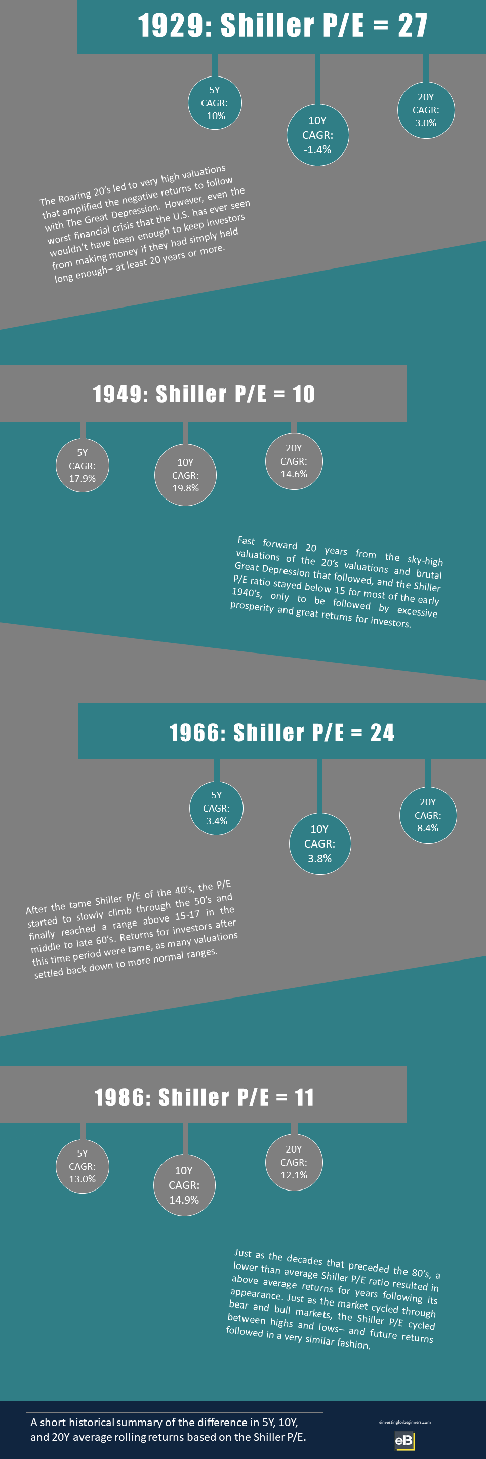
This single stock market infographic is perhaps the biggest selling point for Robert Shiller’s method. It clearly outlines that when the Shiller P/E has been high, the market has done poorly– and vice versa.
In this post, contributor Andy Shuler introduces Robert Shiller and also presents a great chart showing how the Shiller P/E has been less volatile than the regular P/E.
Click to jump to a section:
- Who is Robert Shiller and what’s the Shiller P/E?
- The Basics of the P/E Ratio
- Shiller’s P/E has had less volatility than the market’s regular P/E
But first…
Who is Robert Shiller and what’s the Shiller P/E?
Only one of the most popular stock market valuation ratios.
Robert Shiller is a very famous economist from Yale who wanted to develop a method to measure whether a stock was under or overvalued by comparing it against a much longer history than the normal year that is used when evaluating a stock’s Price to Earnings (P/E) ratio.
Shiller decided that the best way to do this was to use a period of 10 years and adjust it to inflation to determine the PE.
This method is commonly referred to as the Cyclically Adjusted Price-to-Earning ratio (CAPE), or the Shiller P/E.
Essentially, this takes out a lot of the volatility you might see during economic booms and busts. During a recession, most consumers’ discretionary spending is halted, leading to decreased earnings from many companies.
In a normal P/E ratio, two quarters of bad earnings is ½ of the earnings represented in a normal P/E ratio but in Shiller’s P/E ratio, it’s only 5% (2/40 quarters).
To take it back a step, I want to explain the P/E ratio a bit before we get too far into Shiller’s Method.
The Basics of the P/E Ratio
The P/E is essentially how expensive a stock is. It is a very easy formula to understand as it’s the stock price/earnings per share. The higher the P/E ratio, the more expensive the stock is.
For instance, (yes, I know this is a veryyy basic example with no other background at all) if you had the choice to buy a stock with $5 earnings/share (EPS) for $50, or to buy a different stock with $5 EPS for $100, which would you buy?
Hopefully, you’d buy the stock with the $50 share price as the P/E is 10 ($50 price/$5 earnings) instead of the other stock with the P/E of 20 ($100/$5). Essentially, this is saying that you’ll get a stock for half of the price as the other stock.
The Infographic below really is a great way to explain not only why P/E is such an important measure, but why Shiller’s method is an extremely reliable way of measuring how over/undervalued the stock market is in general.
As you can see, there are really four picture-perfect time periods that show that the lower the P/E, the higher the returns had been 5, 10, and 20 years out from that point.
This occurs because you’re buying cheap, undervalued stocks. Those stocks have been undervalued for quite some time because you’re taking out a lot of the volatility by using ten years of earnings and adjusting for inflation.
Shiller’s P/E has had less volatility than the market’s regular P/E
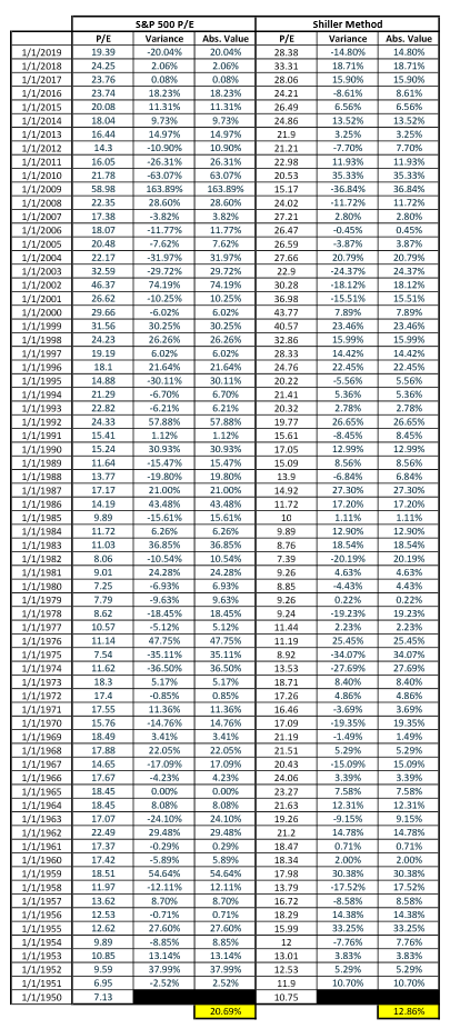
In addition to great returns, Shiller’s method can help reduce the high volatility that can lead to bad decision making when investing in the market.
Since 1950, the average P/E volatility of the S&P 500 realized a variance of 20.69% vs. the prior year while Shiller’s Method has only realized a variance of 12.86%. Don’t believe me? See below:
I think a perfect example is to think of what has happened recently due to COVID and supply chain constraints. The S&P 500 has dropped by over 20%.
Was the market overvalued before that drop?
Eh… yeah… probably.
Many people view this as a “cheap” time to get into the market, but that might not be true – the market might still be overvalued.
According to Shiller’s Ratio, the P/E as of 3/16/2023 was still over 27.8. Compared to historic figures, that is still extremely high. Even after these significant drops, signs point to the fact that we are still in an overvalued market. The market was going up and to the right for several years; that won’t be wiped away overnight.
Andrew and Dave’s tagline on the podcast is: “Invest with a margin of safety…emphasis on the safety,” and there really is no better way to do that than if you can reduce some volatility in the market and look at the market as a whole, over the course of a long time, rather than just certain economic downturns.
All in all, sounds like Shiller knows what he’s talking about.
