Updated 6/4/2024
Have you ever used a saving money chart? Personally, I love them because I can sit there and look at people of different ages and compare myself to them, but there’s one major issue—they’re all awful!
Key Takeaways
- As a rule of thumb, 25X your salary is a good target to retire
- Don’t take any chart as gospel and instead run your own numbers
- The longer your time horizon, the less you need to invest
- The earlier you start, the more room for error you have later in life
So, what types of things are we actually going to learn today?
- The Fallacies of Money Charts
- Not All Charts Are Bad
- Running Your Own Numbers w/ the 4% Rule
- The Perfect Money Chart For Your Time Horizon
The Fallacies of Money Charts
As I mentioned, many of these saving money charts will have these goals that are just the worst advice of all time. It drives me crazy. For instance, check out both of these charts:
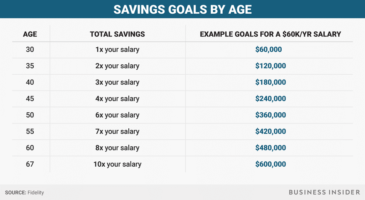
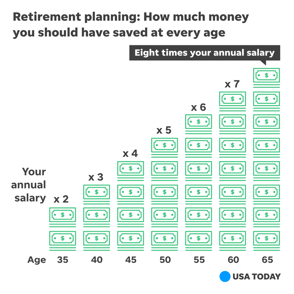
The first one says you should have 10x your salary at age 65, and the second one says you should have 8x your salary at age 65. The upside is that these are super simple numbers to calculate. The issue is that they’re also SUPER WRONG!
Here’s the thing—let’s pretend that both you and your spouse were making $100K, or $200K total, which is a pretty good amount of cash. That means you would need $1.6 – $2.0 million to have 8-10X your combined salary of $200K/year, right?
Well, using the 4% rule, that means that you would be able to withdraw $64K —$80K each year! Now, this sounds like a pretty good amount of money to be able to consistently withdraw without a real fear of ever running out of money, but if you’re used to having $200K in salary each year…you’re not going to be happy.
The same is true for lower salaries, but I think it’s actually even more damaging.
If your salary was only $50K and you were single, you’d have saved $400K, meaning you can only pull out $16K each year.
How the heck would you ever be able to make that last? You can’t.
You see, I love this simplicity, but they’re just so, so, so wrong. And people look at these charts because they look flashy and it’s easy to remember that you only need your salary X 10 or something along those lines, but it’s just awful advice. But those aren’t the only charts that drive me nuts.
This chart makes me mad for an entirely separate reason. Charts like these just don’t tell you anything.
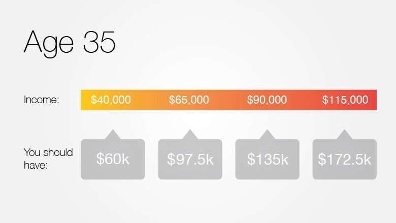
You see, all you know is the amount that “you should have”. You don’t know what age this applies to, the interest rate, the age that you’ll retire if you have this amount…I mean, you don’t really know anything about this, right?
Charts like these may seem silly in this context. However, if someone stumbled across it elsewhere, they may take it as gospel and, say, plan to save X amount by retirement based on their income. This would lead them to drastically underestimate their needs, and potentially ruin their financial future.
Not All Charts Are Bad
Now, I will say that there are some charts that I found that I do like a lot. One of those charts is below:
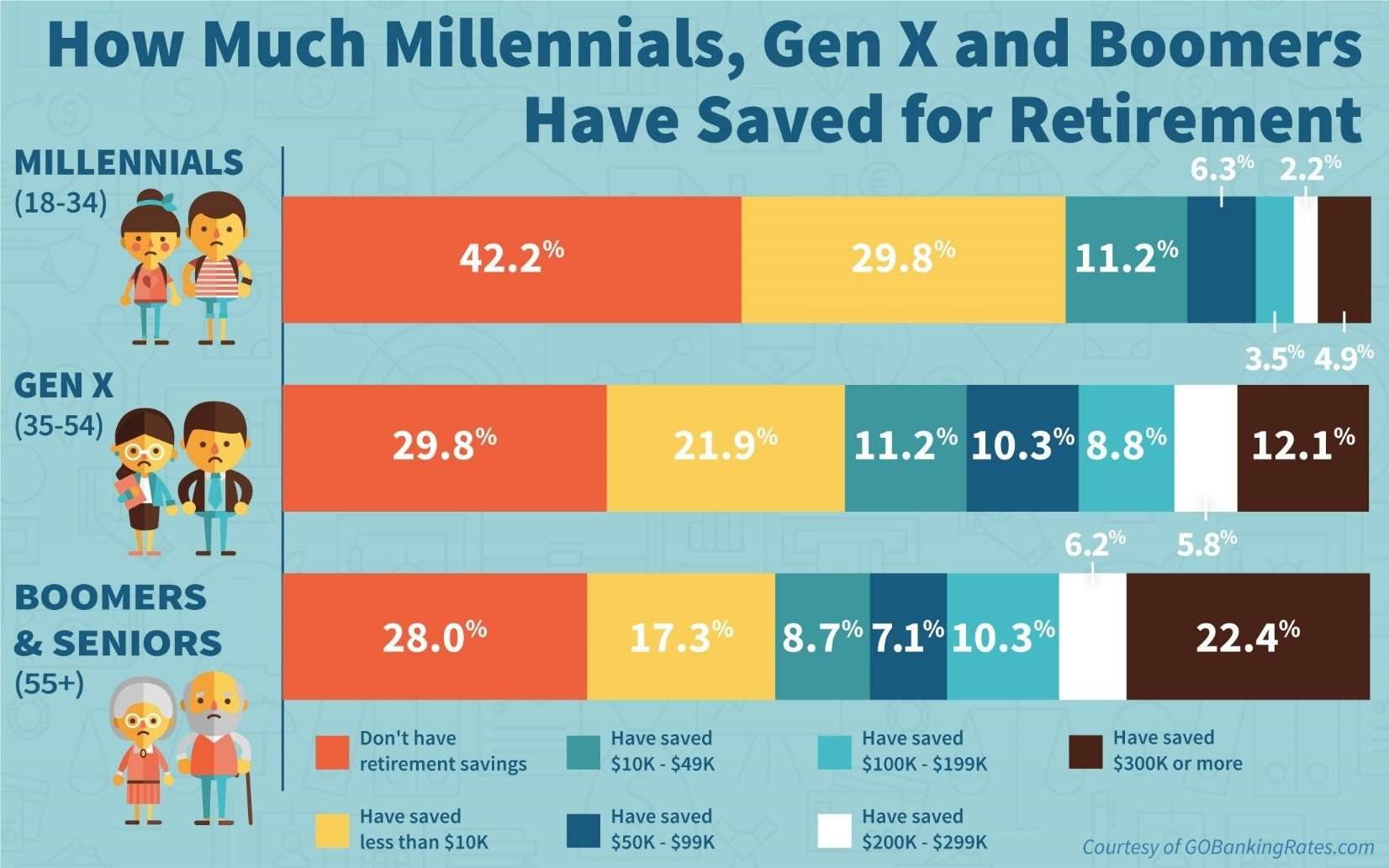
I love this saving money chart because I can find my age range and then see where I fall in line with other people my age. One issue is I wish the age ranges weren’t so broad; a millennial can be anything from a high school senior to someone who’s been in the workforce for nearly two decades, but it is what it is.
But there is no speculation on these—just facts. And the facts are complete. So, I can make sure that I am towards the top of the chart, and if I’m not, then I can work to find a better plan to get to the top.
This chart by Business Insider is one that I like a lot!
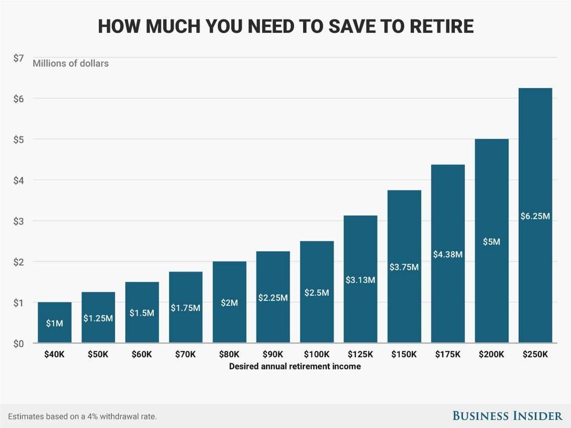
It’s a super simple chart that does absolutely nothing except utilize that 4% rule that I referenced to show you the amount that you’ll need to have saved to have a certain annual retirement income.
I dislike this saving money chart because it seems overwhelming to someone who doesn’t understand the importance of compound interest and how it can completely change one’s life.
Running Your Own Numbers With The 4% Rule
These charts are great as a quick reference. However, they can also help you understand your financial needs and calculate your own retirement needs.
Plus, simplified charts like these completely miss a big factor: increasing income over time. Assuming you plan to get raises/promotions over time, these charts completely miss that. By running your numbers, you can play with your income values to find a more accurate end goal.
Trust me, it’s worth the headache up front.
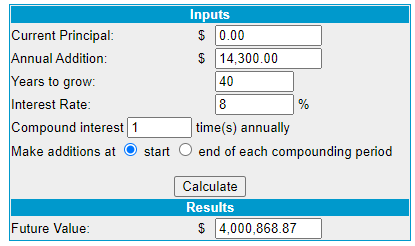
For instance, if you make $100K/year, then the most you’ll make in 40 years is $4 million, right? There’s no way that you can ever save that much money. You would have to save 62.5% of your money, or $2.5 million, to be able to withdraw $100K/year in retirement, assuming you didn’t invest any of it.
Or, you could invest some of it, a small amount really, at an 8% return rate (when the stock market return rate is much higher in all actuality), and then you can end up with $4 million pretty easily.
As you can see, simply investing $14,300/year for 40 years will get you there. Not too shabby right?
Or, if you only wanted to get to that $2.5 million number that I mentioned, you can invest much less:
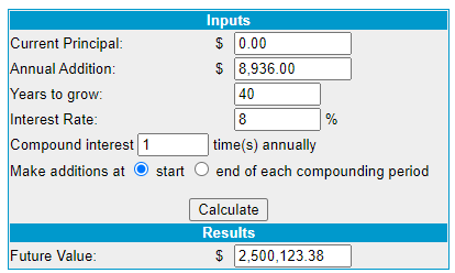
See that? Not even $8K can get you to $2.5 MILLION in 40 years.
That is the power of compound interest and if you’re not taking advantage, you need to change that ASAP.
You can simply do the same math that I am doing by using a compound interest calculator, with my favorite being from moneychimp.
The Perfect Savings Money Chart for Your Time Horizon
You know what? Some of these charts are good, some are ok, and some are awful…but maybe I’m just whiny and impossible to please.
I think I will make my charts to show EXACTLY what needs done.
I decided to make 5 different charts that show a different time horizon between 20-40 years, in 5-year increments, to show exactly the amount of money that you need to have saved to reach a goal of $1 million, $2 million, $5 million or $10 million. I also assumed the 8% return rate that I mentioned above, so if the actual returns from investing in the market are above that, then you’re just going to be able to get to your goal that much quicker!
Let’s take a look at the first chart for a 20-year Time Horizon:

The goal of these charts was essentially to break down exactly where you need to be depending on your outlook for when you want to retire.
So, let’s imagine that you want to retire with $2 million in 20 years and haven’t started saving. Don’t worry! To be on track after that first year, you need to have $43,705 saved for retirement.
That’s a pretty steep target, but saving $2 million from scratch in 20 years is a pretty steep goal! So, it will take some pretty serious motivation and dedication on your part, but that doesn’t mean it cannot be done.
Now, if you were three years into the same journey of wanting to get to $2 million in 20 years, you better have at least $141,885 saved up and set aside for retirement! If you don’t, you’ll potentially be in a bit of trouble down the road.
I want to point out that when I use an 8% return, that return is applied evenly to all years. So, if you think that the stock market is going to return 8% on average, some years might have a 20% return, and some might have a drop from the previous year.
A perfect example is in 2019 when the S&P 500 was up 30% or even a great year of 16% in 2020. If all you did was maintain the same pace after a 30% year (or 16%) in the market, then your actual contributions to your retirement goal were likely lacking. There are going to be some years where you’re going to drop in value, I’m sure, and some years where you’re going to explode.
I mean, if you were sitting there in year 17 and you got a 30% increase in your investments, plus the amount you contributed to the market, then you could hit your $2 million goal the next year and only need 18 total years.
At the same time, if you’re sitting there with $1.8 million in year 19 and the market drops, you will likely need an extra year or two to achieve your goal now.
The market is fluid, and your goals need to be as well – you can only control what you can control, so just view the S&P 500 returns as something that you can’t control and just focus on benchmarking your performance against the index and trying to beat that index.
That is going to make/keep you a much more sane, rational, and opportunistic investor.
Ok, let’s move on to the next chart!
You’ll notice that everything in the chart is the same with the exception that the timeframe has been extended by 5 years to 25 years:

By extending the timeframe, you have only allowed yourself to have a smaller goal to reach each year. If you remember correctly, the amount you needed after Year 1 if you were targeting $2 million was $43,705.
Adding another 5 years means you only need to have $27,539 after Year 1. You added 25% to your investing timeframe, and now your Year 1 balance can be dropped by 37%! That’s pretty drastic.
This tells me that time is more important than ever, meaning that you need to do whatever you can to start early because even small investments add up.
Understanding how the difference in your timeframe impacts the amount you need to save each year is imperative. I recommend always starting with a realistic goal but also having a “stretch” goal that can push you to save/invest at an even faster rate.
I am a big fan of SMART goals, which stand for Specific-, Measurable-, Achievable-, Realistic-, and Time-Oriented goals. Therefore, you need to make sure that your investing and retirement goals meet these criteria as well.
The next chart is using a 30-year time period:

As you can see, the total amounts that you need to have are starting to decrease drastically on an annual basis.
Utilizing Tax-Advantaged Accounts
For that same $2 million goal, you’re now down to just $17,656 in Year 1, which you could max out SOLELY on tax-advantaged accounts using a 401k, IRA and HSA, and I recommend trying to do that.
In order of importance, I would do the following:
- 401k up to your company match – it’s free money and a 1600% ROI!
- HSA – it’s pretax money going in, grows tax free, and tax free coming out for ANY reason if you can wait until age 65 – TRIPLE TAX ADVANTAGE!
- IRA – it’s tax advantaged on the front end with pre-tax money when you use a traditional or when you withdraw with a Roth. My recommendation for most people is a Roth, but it all depends on your situation!
- 401k up to the remainder of the max. While you likely have less investment options than you do with a brokerage account, it’s still a tax advantage so you NEED to take advantage of that
Onto the next chart for a 35 year time horizon:
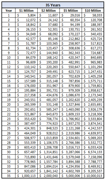
Things are really starting to look pretty manageable now! $2 million will generate you $80K in annual withdrawals in retirement, which is a ton of money.
Also, since this plan is 35 years, if you start at 25, you would be retiring 5 years earlier than the “normal” retirement age of 65, and you hopefully can have your house paid off if you’re on a 30-year mortgage.
So, you have $80K with no housing costs except taxes? Count me in!
You need to invest less than $12K annually to have $2 million in 35 years. The IRA max in 2019 is $6K, so if you and your spouse both max that out and do nothing else, you’re well on your way and actually ahead of schedule!
The last chart goes to 40 years:
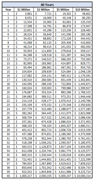
Down under $8K/year now to hit your goal. Do you know what this tells me? Start as early as you can. Start in college. Or high school. Or maybe even invest in your kids!
We invest for our son because even a small amount like $100/month can earn him millions!
I highly recommend that you examine your time horizon and goals to see if you’re on track.
For instance, if you’re 30 and have been investing for 5 years and want to retire when you’re 50, then you need to use the 25-year chart because it’s 25 years from start to finish.
If you’re not where you need to be, you need to take a deep dive and discover why. Are you not saving enough? Are you not investing it? Are you not investing it properly? Was the market down?
You have to find the issue. These charts are a great way to compare yourself to your own goals and post-audit your performance. If you’re not where you need to be, it’s better to find out now than it is when you want to retire.
Get on it.
Now.
